Since we can use the ZiZo graph to show a month at a glance or zoom all the way in to a particular day, the trend is quick and easy way to compare your zoomed in value with data from the previous 30 days.
As an example: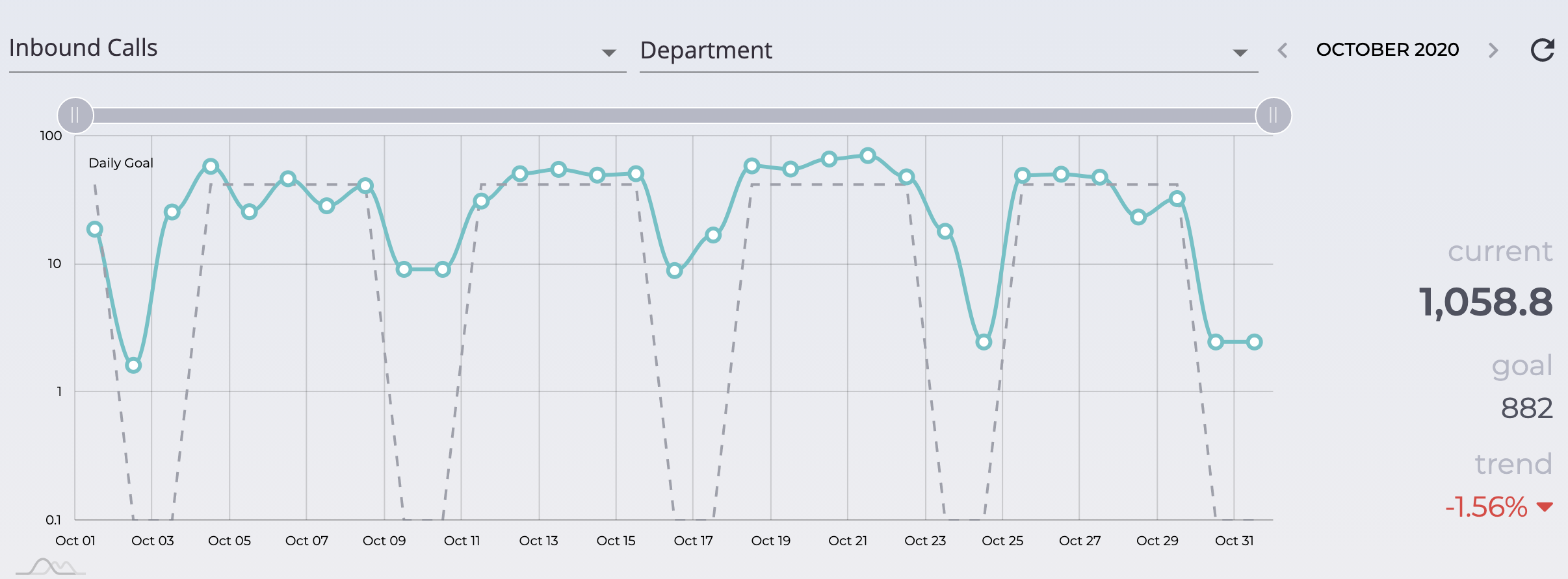
Above your ZiZo graph shows from a managerial view, that your departmental in-bound call volume of 1058 has exceeded your monthly goal average of 852. However your trend shows a -1.56%. This simply means that the department has answered 1.56% less in-bound calls than the last 30 day period. You have still exceeded your monthly goal average.
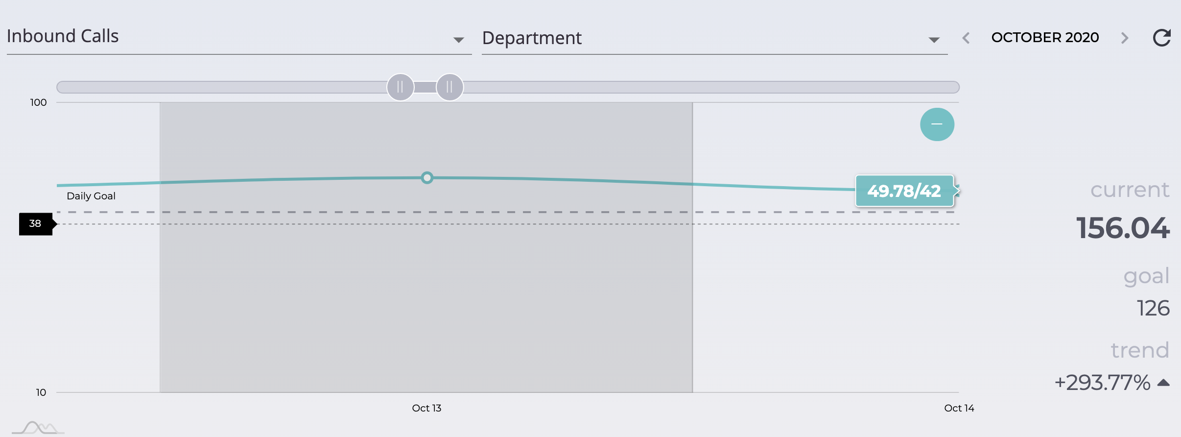
Zooming all the way in to show one day (i.e. Oct 13th), the trend is showing that the department answered 293% more inbound calls on that particular day, than you did 30 days prior.
So the trend is an easy and fun way to see just how you're doing!