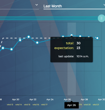
What do the dots indicate on the ZiZo dashboard performance graph?
The dots on the graph represent data points or specific values for a KPI on that work day.
When using your dashboard performance graph, there are some great ways in gaining valuable information about your past and present productivity. One of those ways is by using the dots on the graph (or data points) to reveal information on a KPI for that day.
The data point represents the KPI value achieved during a particular time period. This data point will be sitting either above, below, or on the dashed line (see: expectation level).
Mousing over the data point will open a tool tip to reveal more specific information. The image below is showing that the user accomplished a total of 30 (KPIs) while having an expectation of 23 (KPIs) for their particular rank and level.
Double click the data point and the performance graph will zoom in to reveal what hours within that day the KPIs were achieved.
